


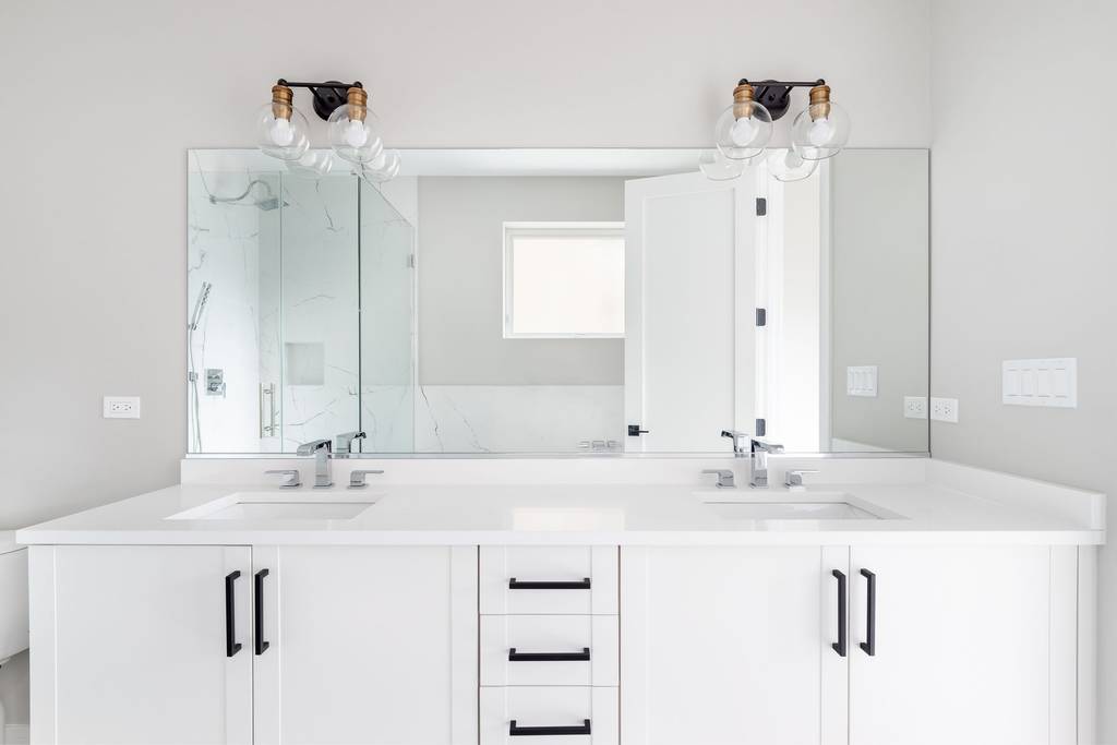
White bathrooms are the default setting for modern homes. They are clean. They are bright. They are also often soulless.
Step into one with nothing but white tiles and a white tub, and you might feel less like you are relaxing and more like you are prepping for surgery. The issue isn’t that white is bad. It’s that pure white, unchecked by anything else, becomes stark. Clinical. A dead zone.
You don’t need a contractor. You don’t need to tear out your vanity. You just need a few simple tricks to add warmth, texture, and personality without the high cost of renovation. Here is what top interior designers say about fixing the cold, sterile vibe.
The “Lab” Problem: Why Plain White Fails
Brittny Button, an interior designer, puts it bluntly. An all-white bathroom without contrast lacks tonal color. It lacks warmth. It lacks cool tones that might offer some depth.
“It’s devoid of tonal color,” Button says. “It can come off as bland.”
The result is a space that feels like a lab. Not a sanctuary. When every surface is the same shade, your eye has nowhere to rest. The brain registers this uniformity as empty rather than serene. To fix it, you need to break the monotony.
Start with inspiration from spas. Look for materials that introduce warmth. Think creams. Think teaks. Think cedar woods. These natural, warm tones counteract the harshness of stark white surfaces. They ground the room.
Lighting: The Unsung Hero of Ambience
Lighting makes or breaks a white room. Julie Mays, another design expert, notes that natural light is the ultimate game-changer. If your bathroom has a window, you have an advantage. Sunlight softens white surfaces and adds movement through shadows.
But what if you have a windowless powder room? Or a basement bathroom?
Without natural light, an all-white space feels sterile. Fast. You have to create that softness artificially. Mays suggests swapping out mirror frames and light fixtures. Lean into warmer tones. Choose lightbulbs with a lower Kelvin rating (around 2700K-3000K) to cast a yellowish, inviting glow. This simple shift can make a clinical room feel like a cocoon.
Adding Texture to Avoid the “Smooth” Trap
Smooth tiles. Porcelain fixtures. Glossy cabinets. It’s all slick. It’s all flat.
Brittny Button points out that this lack of texture is a major visual offender. Smooth surfaces don’t attract the eye. They bounce light away, amplifying that clinical feel.
So, what do you do? Add texture. And lots of it.
You can introduce this through smaller items without touching a single tile:
* Hardware: Switch out plain knobs for textured metal or wood pulls.
* Textiles: Use fluffy towels. Linen shower curtains. Shaggy rugs.
* Decor: Art with texture. Woven baskets.
“Introducing texture with hardware pulls, towels rugs, shower curtains art, and home decor can elevate the room.” — Brittny Button
Texture creates shadows. Shadows create depth. Depth creates interest.
The Peace Problem: Why Contrast Matters
Lauren Kyle, interior designer, shares a common complaint. She can’t feel peaceful in a plain white bathroom. Why? Because peace often requires contrast. It requires a visual pause.
Without contrast, the room feels urgent. Or worse, indifferent.
Kyle recommends playing with patterns. Not overwhelming ones, but distinct ones. A patterned rug can instantly add a cozy feel. It anchors the foot. It breaks up the expanse of floor. Add some art to the walls. Hang a tapestry. Get creative with decorative accessories. These elements provide the visual anchors your brain craves for relaxation.
How to Add Drama Without a Renovation
You might want a bold look. You might crave drama. But you don’t need a new tub to get it.
Brittny Button suggests using paint. Painting the walls a color distinct from the vanity. Painting the vanity a different shade than the walls. This creates a layered effect. It adds dimension.
And don’t overlook the floor. White tile flooring can look very impersonal. Add a large, dark, or patterned rug to obscure it. This simple step changes the entire mood of the room. It adds softness underfoot and visual weight to the space.
Choosing the Right Colors: The Fine Line
Adding color is not as simple as grabbing any paint swatch. There is a trap.
Brittny Button warns against extremely bold, saturated colors. Avoid royal purples. Avoid acrid yellows. Avoid forest greens. These shades compete with white rather than complementing it. They create a jarring, high-energy clash.
Julie Mays agrees. Stark colors are a hard pass. Hot pinks. Bright oranges. Electric yellows. These are difficult to pull together in any space. Against a white background, they can feel aggressive rather than vibrant.
“[They] don’t work in a space that’s supposed to help you unwind,” Mays says.
Instead, look for tones that are soft. Soothing. Grounded. Think blush pinks, dusty blues, warm taupes, and soft grays. These colors whisper. They don’t shout. They blend with the white while still providing the contrast needed to break up the sterility.
The Result
A white bathroom doesn’t have to feel cold. It doesn’t have to feel like a hospital wing. With a little attention to light, texture, and muted color, you can turn a sterile space into a warm retreat.
It starts with small changes. A warmer bulb. A softer towel. A darker rug. You might think the difference is minor. It’s not. It’s the difference between feeling exposed and feeling held.
Try it. See if you feel calmer. Then wonder why you didn’t do it sooner.


